


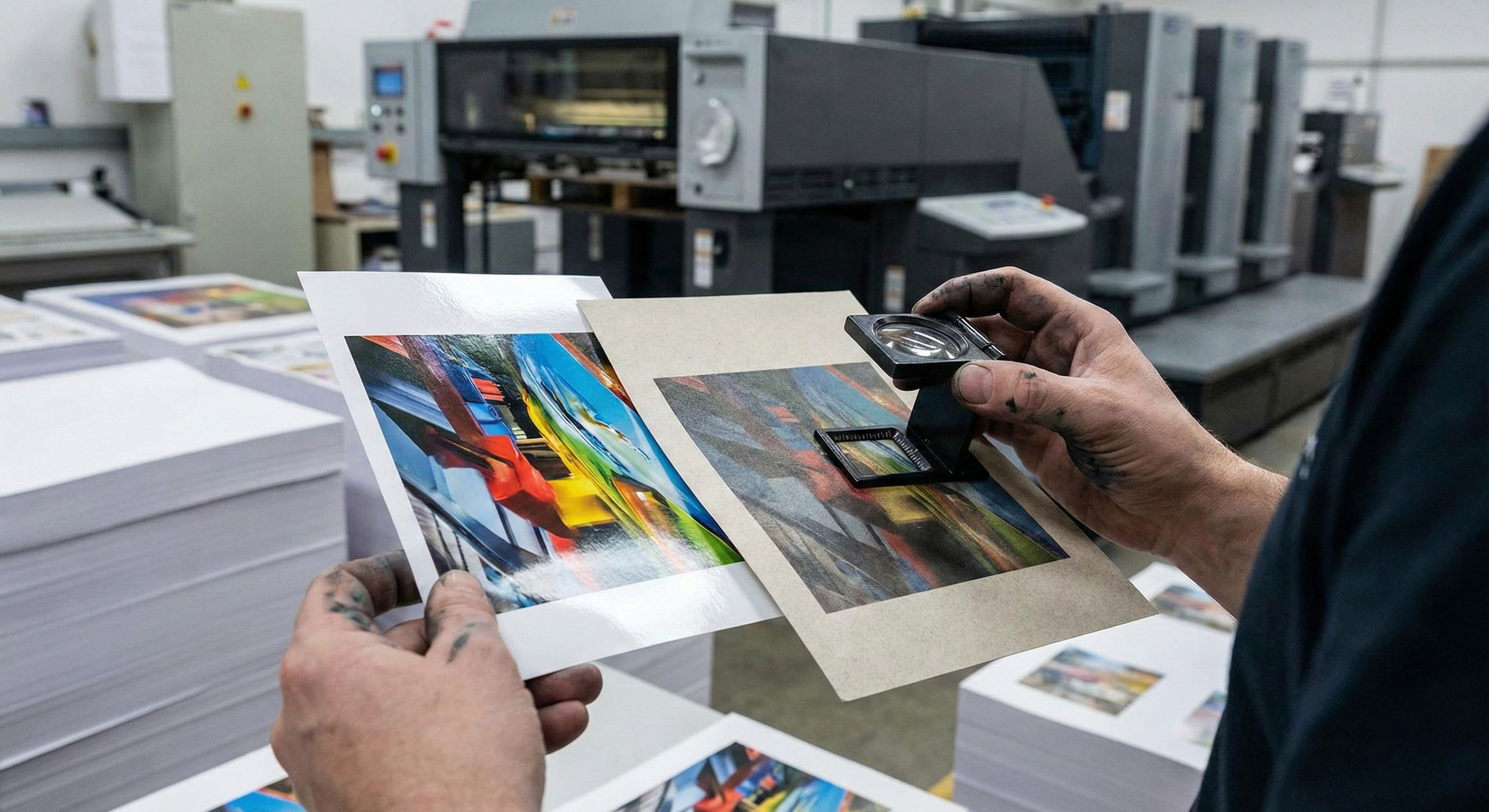
It is the classic design nightmare. You spend hours perfecting a brochure on your high-definition 4K monitor. The photos are crisp, the shadows have depth, and your logo is a precise, vibrant blue. You send the file to print, and when the boxes arrive, your heart sinks.
The images look “muddy.” The crisp lines feel thick. The colors are muted and darker than the digital file.
Did the printer make a mistake? Likely not. You have simply encountered a fundamental law of physics in the commercial printing industry: Dot Gain, technically known as Tonal Value Increase (TVI).
At Branding Centres, we believe that predictable color management is the bridge between a good design and a professional product. Whether you are printing 10,000 flyers for a GTA marketing campaign or luxury business cards in Etobicoke, understanding the physics of Coated vs. Uncoated paper is the secret to ensuring your physical marketing materials match your digital vision.
What is Dot Gain (TVI)?
To understand why your prints look different, you must first understand how printing works. We do not paint with continuous strokes; we lay down a grid of microscopic dots (halftones). On your computer screen, a “50% Grey” is a mathematical absolute.
However, when liquid ink hits physical paper, it spreads. Much like a drop of water landing on a paper towel versus a glass table, the liquid interacts with the surface tension. That 50% dot you designed on screen might physically spread to become a 60% dot on the paper.
This expansion is Dot Gain. If your designer does not account for this expansion (TVI) during the file preparation phase, your images will print significantly darker because the dots grew larger than intended, filling in the white space that provides “light” to the image.
The Variable: The Paper Surface
While the press setup plays a role, the severity of dot gain is determined almost entirely by the substrate (paper) you choose. This is where the battle between Coated vs. Uncoated stock begins.
1. Uncoated Paper (The “Sponge” Effect)
Uncoated paper is raw and porous. It has a tactile, organic feel (think: high-end letterhead, novels, or notepad paper). Because it lacks a sealing layer, the fibers are exposed.
• The Physics: When wet ink hits uncoated paper, it is absorbed into the fibers. As it soaks in, it spreads outward – a phenomenon known as mechanical dot gain.
• The Data: Engineering research on solid ink density indicates that black ink on uncoated paper can experience a dot gain max value of roughly 18.5%, compared to significantly lower values on coated stocks.
• The Visual Result: Images appear softer (less sharp) because the ink spread bridges the gaps between fine details. Colors appear darker and less saturated (muted) because the ink is absorbed into the paper rather than reflecting light from the surface.
2. Coated Paper (The “Whiteboard” Effect)
Coated paper is treated with a clay or polymer layer that fills the microscopic gaps between the paper fibers. This creates a smooth surface that can be Gloss, Satin, or Matte.
• The Physics: The coating acts as a barrier. The ink sits on top of the paper rather than soaking in. This is often referred to as “ink holdout.”
• The Visual Result: Low Dot Gain. Because the ink stays on the surface, the dots hold their shape much better, resulting in sharper edges and finer detail.
• Vibrancy: Coated paper reflects more light back through the ink to the eye, making colors appear punchy, high-contrast, and vibrant.
Designing for the Drop: How We Compensate
When you send a file to Branding Centres, our prepress team analyzes your paper choice to apply the correct compensation curves. However, understanding this process helps you design better files from the start.
Strategy A: Printing on Uncoated Stock
If you want the premium, textured feel of uncoated paper for a corporate identity package, you must design with “The Sponge Effect” in mind.
1. Lighten Your Images: You need to “open up” the shadows. If a detail in a photo is 85% black on screen, dot gain will likely turn it into a solid 100% black blob on uncoated paper. We recommend brightening mid-tones and shadows by 10-15%.
2. Avoid Heavy Ink Coverage: Do not use “Registration Black” (100% of all four CMYK colors). The porous paper cannot handle that much liquid; it will spread and muddy the text. Use a standard black or a light rich black.
3. Choose Uncoated Pantones: When selecting spot colors, use the “Pantone U” (Uncoated) swatch book. The same ink formula looks completely different on coated vs. uncoated stock.
Strategy B: Printing on Coated Stock
Coated paper is the standard for flyers, brochures, and catalogs where photography is the hero.
1. Push the Saturation: Because the paper reflects light, you can afford to use vibrant, high-density colors without fear of them becoming dull.
2. Fine Details: You can use smaller fonts and finer lines (down to 0.25pt) because the ink will not spread and bridge the gaps between letters.
Summary Comparison: What to Expect
| Feature | Coated Paper | Uncoated Paper |
| Surface Texture | Smooth (Gloss, Matte, Satin) | Rough, Porous, Natural |
| Ink Behavior | Sits on surface (Low spread) | Absorbs into fiber (High spread) |
| Dot Gain (TVI) | Low (Precise) | High (Darkens images) |
| Color Vibrancy | High (Reflective/Punchy) | Low (Muted/Organic) |
| Drying Time | Slower (Needs time to set) | Faster (Absorbs quickly) |
| Best Use Case | Photography, Flyers, Catalogs | Stationery, Books, Letterhead |
Conclusion: Trust the Process
Dot gain is not a defect; it is a physical characteristic of printing. The “mistake” only happens when the design file ignores the substrate.
Whether you are looking for the sharp, high-contrast pop of a glossy flyer or the sophisticated, muted elegance of an uncoated business card, the team at Branding Centres ensures your files are engineered for the specific paper you choose. We adjust the math so you don’t have to.
Ready to start your next print project? Contact us today at info@brandingcentres.com or call us at +1-(416) 288-8661 to discuss which paper stock is right for your brand vision.
Frequently Asked Questions (FAQ)
1. Why does my logo look different on my business card than on my brochure?
This is usually a Coated vs. Uncoated issue. Brochures are typically printed on coated gloss text (vibrant), while business cards are often printed on uncoated cardstock (muted). Even if the exact same ink values (CMYK) are used, the uncoated stock absorbs the ink, making it look darker and less saturated.
2. How much dot gain is normal?
Standard industry tolerances (such as GRACoL or SWOP) generally expect dot gain to be around 20-25% in the mid-tones for uncoated paper, and significantly less for coated paper. However, this varies based on the press and ink density.
3. Can I prevent dot gain entirely?
No. It is a physical property of liquid ink touching paper. However, it can be compensated for. By applying “curves” in the ripping process (Pre-Press), we essentially tell the printer to print a 40% dot so that when it spreads, it becomes the 50% dot you wanted.
4. Is coated paper better than uncoated?
Not necessarily; it depends on the goal. Coated paper is “better” for detail and color pop. Uncoated paper is “better” for readability (no glare), writability (you can write on it with a pen), and conveying a sense of texture and luxury.
5. Does digital printing have dot gain?
Yes, but it behaves differently than traditional offset printing. Digital toner sits on top of the paper more than liquid ink, often resulting in less absorption-based dot gain, but “optical dot gain” (how light scatters) still affects the final look.


