


In the world of graphic design and commercial printing, “Black” is not a singular color. It is a spectrum.
If you have ever designed a business card on your computer with a black background, only to have the printed version come back looking like a dark, washed-out charcoal grey, you have fallen victim to the difference between Standard Black and Rich Black.
On a backlit monitor (using the RGB color model), black is simply the absence of light. It looks deep and infinite. But on paper or vinyl (using the CMYK color model), black is an ink. And a single layer of black ink is rarely enough to create the deep, void-like darkness that luxury brands and professional designs require.
At Branding Centres, we see this file preparation error more than any other. Whether we are printing 5,000 flyers or wrapping a fleet of trucks, understanding how to engineer your black inks is the difference between a “DIY look” and a professional finish.
What is Standard Black? (100% K)
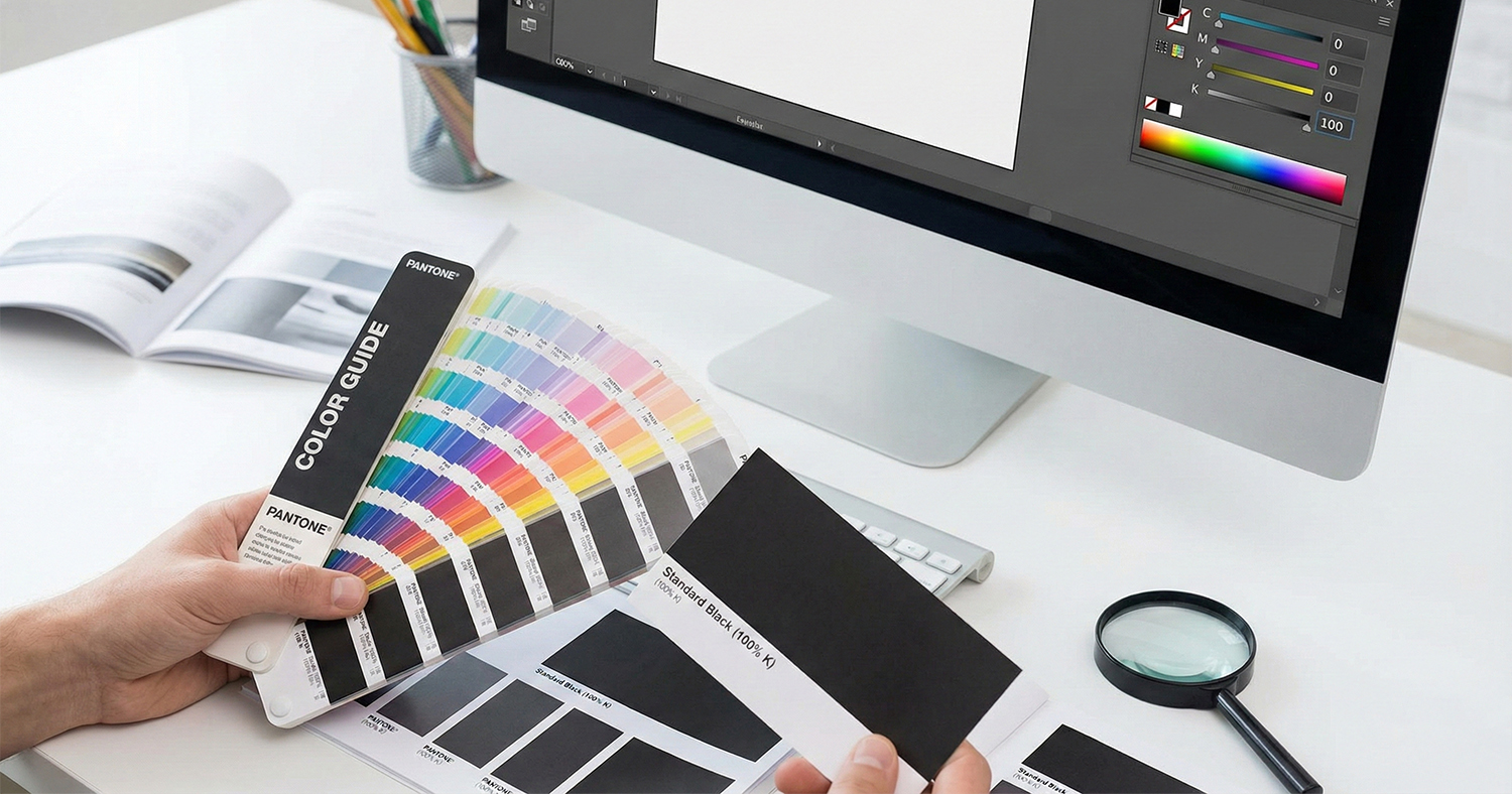
Standard Black (also known as Plain Black or Flat Black) consists of only one ink: Black (K).
• CMYK Value: C=0, M=0, Y=0, K=100.
In the printing process, this means the printer uses only the black plate to lay down ink. No Cyan, Magenta, or Yellow is added.
When to Use Standard Black
You might assume that “more ink is better,” but Standard Black is the industry requirement for specific elements:
1. Body Text and Fine Lines: If you are printing text smaller than 12pt, you must use Standard Black.
2. Barcodes and QR Codes: These require crisp, sharp edges to be scannable.
3. Grayscale Documents: Manuals or forms that do not require color processing.
The “Ghosting” Risk
Why not use Rich Black for small text? In offset and digital printing, the paper moves through the press at high speeds. If you use a mix of four colors (Rich Black) for tiny text, even a microscopic misalignment of the plates (known as misregistration) will cause “ghosting.”
Ghosting creates a fuzzy halo of Cyan or Magenta around your letters, making the text look blurry and vibrating to the eye. Standard Black eliminates this risk because it only uses one plate – there is nothing to align.
What is Rich Black? (The Designer’s Choice)
Rich Black is a composite color. It relies on the 100% Black ink as the base but adds “undercolors” of Cyan, Magenta, and Yellow to boost the density and opacity of the result.
• The Result: A black that looks “inkier,” deeper, and more neutral than the naturally brownish-grey tone of raw black carbon ink.
When to Use Rich Black
1. Large Solid Areas: Backgrounds on brochures, postcards, or heavy block graphics.
2. Large Headlines: Typography that is bold enough (usually 30pt+) to withstand slight registration shifts without affecting legibility.
3. Vehicle Wraps: To ensure the vinyl blocks out the underlying vehicle color completely.
The Branding Centres Formula
There is no single “Rich Black,” but there are dangerous ones (which we will discuss next). At Branding Centres, for most standard offset and digital projects, we recommend a specific “Designer Rich Black” mix to ensure a neutral, deep tone:
C=60 M=40 Y=40 K=100
This formula (60-40-40-100) creates a cool, dense black without over-saturating the paper.
The Danger Zone: Registration Black and TAC
Novice designers often think, “I want the blackest black possible,” and drag all the CMYK sliders to 100%. This creates Registration Black (100-100-100-100).
Never use this for design elements.
Registration Black is reserved exclusively for “crop marks” and “registration targets” outside the trim area so the press operator can check alignment on all four plates.
The Science of “Ink Soup”
If you print a large background with 100% of all four colors, you have a Total Area Coverage (TAC) of 400%. Paper has a physical absorption limit. When you exceed roughly 300% to 320% ink coverage:
• The paper becomes a soup: It gets oversaturated and loses structural integrity.
• Set-off: The ink won’t dry fast enough. When the next sheet lands on top of it in the delivery tray, the wet ink transfers to the back of the sheet above it, ruining the job.
• Blistering: On vehicle wraps or coated papers, the solvents in the ink can attack the surface or adhesive if laid down too thick.
Always keep your Rich Black total sum under 300%.
Paper Stocks: The Variable You Forgot
The formula for your black should also change based on the material you are printing on.
• Coated Paper (Gloss/Matte): Ink sits on top of the coating. You can use the standard 60/40/40/100 mix for a glossy, deep finish.
• Uncoated Paper (Letterhead/Envelopes): Ink soaks into the fibers (dot gain). If you use a heavy Rich Black on uncoated stock, it will spread and look muddy. We often recommend reducing the under colors to C=30 M=20 Y=20 K=100 for uncoated stocks.
Summary Checklist: Which Black Do I Use?
| Design Element | Recommended Color Mode | CMYK Values | Why? |
| Body Text | Standard Black | 0-0-0-100 | Crisp edges, no ghosting. |
| QR Codes | Standard Black | 0-0-0-100 | Maximum scannability. |
| Backgrounds | Rich Black | 60-40-40-100 | Deep, professional color. |
| Large Headers | Rich Black | 60-40-40-100 | Avoids looking “flat” or grey. |
| Crop Marks | Registration Black | 100-100-100-100 | Visible on all separation plates. |
Conclusion: Engineering Your Brand Colors
Printing is a manufacturing process, not just a creative one. Understanding the technical specifications of ink ensures that your marketing materials look as expensive as they feel. Whether you are printing high-end business cards or wrapping a 53-foot trailer, using the right black prevents costly reprints and disappointment.
At Branding Centres, our prepress team inspects files for these exact issues, ensuring your blacks are rich where they need to be and sharp where they must be.
Ready to print with precision?Contact Branding Centres today at info@brandingcentres.com or +1-(416) 288-8661 to get your project started on the right foot.
Frequently Asked Questions (FAQ)
1. Why does my black look gray on screen but prints fine?
Actually, it usually happens the other way around. Most screens are not calibrated to print standards. Adobe InDesign and Illustrator have a setting called “Appearance of Black.” If this is set to “Display All Blacks Accurately,” you will see Standard Black as a dark grey and Rich Black as a deep jet black. This helps you spot the difference before you print.
2. Can I use Rich Black for text if the font is really big?
Yes. If your text is large (generally over 30pt or a very bold headline style), you can use Rich Black to give it more punch. Just avoid it for body paragraphs or fine serif fonts.
3. Does Rich Black cost more to print?
In digital and offset printing, “full color” is usually a flat rate regardless of how much ink coverage you have. However, using Standard Black for text-only documents allows you to print in “Grayscale” or “1-Color” mode, which is significantly cheaper than 4-Color printing.
4. What happens if I use Photoshop’s default black?
Photoshop’s default black (in RGB mode converted to CMYK) often converts to something like C=75 M=68 Y=67 K=90. While this creates a dark color, the K (Black) value isn’t 100%, which can sometimes look “muddy” or overly brownish in print. It is always better to manually set your CMYK values.
5. How do I check if my black is set correctly in my PDF?
You can use the “Output Preview” tool in Adobe Acrobat Pro. By hovering your mouse over the black areas, you can see the exact ink percentages. If your text shows values for C, M, and Y, it is set to Rich Black and should be changed to 100% K for sharpness.


